July 23, 2024


With Dan Reith—Principal Broker, Property & Casualty, Reith & Associates
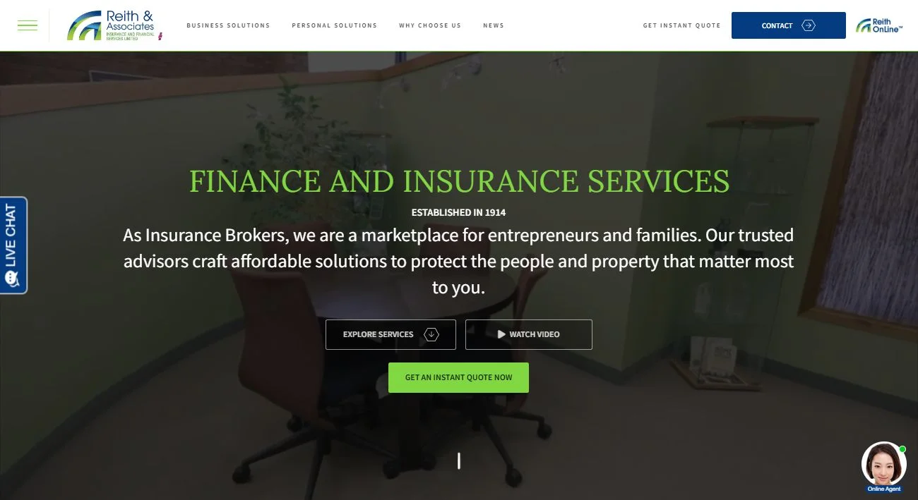
Last year, leadership at Reith & Associates decided to undergo a complete redesign of their website. The new site went on to win recognition at the 12th Web Excellence Awards.
“Our primary goal for the redesign was to create a site that truly reflects our brand and highlights the full range of services we provide as brokers,” said Dan Reith, Reith & Associates. “The redesign was specifically aimed at catering to families and entrepreneurs, deliberately discouraging those solely looking for lower premiums—since we don’t control pricing, it’s counterintuitive to make it our focus.
“We observed a growing trend towards more interactive and user-friendly websites in the insurance brokerage industry. Competitors were enhancing their digital presence, making it essential for us to stay competitive and meet the evolving expectations for our clients.”
The redesign provides an easy-to-use platform for online searches, expanding access to Reith & Associates’ brokers. The new design streamlines navigation and enhances functionality with a user-centric experience, clear calls-to-actions and interactive tools. Guests can interact with a live chat feature in lieu of an AI chat bot.
“It speaks to what we do and presents a clear message on how we do it.”
User Experience
“Client feedback was a major motivation for this redesign. The previous website was cumbersome with issues like buffering and loading errors, poor navigation and limited resources. Although the general messaging was on point, users couldn’t experience it enjoyably.”
Their new design philosophy centered around simplicity, clarity and user engagement. Their aim was to create a visually appealing yet functional site that intuitively guides users to information they need. Emphasis was placed on minimalistic design, ample white space and high-quality visuals.
The new design enhances user experience by providing quick access to essential information and services, interactive features such as quote calculators and FAQ sections, and personalized client portals for managing policies and claims.
“We adopted best practice in web accessibility to ensure the site is usable by everyone, including those with disabilities. This includes ARIA (Accessible Rich Internet Applications) roles, ensuring colour contrast compliance providing text alternatives for non-text content, and making the site navigable via keyboard. These improvements have made the site more inclusive, benefiting all users.”

Tech Upgrade
“The previous website had issues with slow loading times and limited mobile responsiveness. Addressing these performance bottlenecks was a priority.”
They implemented several technical improvements including faster load times by optimizing images and leveraging caching, enhanced mobile responsiveness with a responsive design framework, improved site architecture for better navigation, and integration of advanced analytics to track user behavior and site performance.
SEO was a crucial factor in the redesign process. They conducted thorough keyword research and optimized on-page elements such as meta tags, headers and content. The new site structure is designed to be SEO-friendly, ensuring better crawlability by search engines. They also implemented schema markup to improve SERP visibility.
Redesign Process
The project took about eight months from concept to completion. A portion of that time was due to sending back the first set of wire frame designs for an overhaul. Some time was required for underlying coding, followed by content funneling and layout approval.
“Despite minor language issues with our US-based designers, the end product far exceeded our expectations.”
Measuring Success
“We plan for continuous improvement by regularly reviewing user feedback and analytics data to identify areas of enhancement. When feedback is received by our team, it’s funneled and tracked internally, with every comment reviewed and considered for continuous improvement. User feedback since the redesign has been overwhelmingly positive—clients appreciate the design aesthetic, intuitive navigation and overall speed of the site.”
